Blog · Développement web
Create an effective landing page: tips and tools to build landing pages that convert!

How to create a landing page that turns visitors into customers? Scroll shares its method for crafting an effective landing page in 4 steps!
Despite the traffic you capture, are you struggling to convert? Do users who land on your site tend to leave without buying your products or using your services? It might be that your landing pages aren’t optimized. Discover how to create an effective landing page that captures traffic and turns it into business!
What is a landing page?
A landing page, in French, is an arrival or destination page: it’s the page where internet users first land on your site.
For example, imagine you’ve created ads on Facebook—you’ll need to choose your landing page. Where do you want to direct users?
If you’ve highlighted a specific product, you’ll likely want to send them to the dedicated product page. If you’re advertising to promote a deal, direct users to the promotion page.
While the concept is indeed very simple, many landing pages still face a major issue: they don’t convert. Users may click on your ads, but they don’t buy your products. How can you improve conversions by creating effective landing pages?
Examples of Effective Landing Pages
To learn how to create landing pages that convert, the first step is to observe. What are your competitors doing? What are the major web players doing? Companies like Amazon spend thousands of euros each year to improve conversions on their sites. Note: this isn’t about copying them but understanding the mechanics they use.
To see what’s being done, analyze the landing pages in ads or newsletters. You can also simply search on Google and look at the top results. However, keep in mind that landing pages in Google’s organic results are often optimized for SEO, not necessarily for conversion.
Here are a few examples of landing pages we find interesting.
Landing Page Example: AliExpress
You’ve probably heard of AliExpress—the massive Chinese marketplace is one of the web’s giants. When you place an order with them, you’re sure to receive dozens of follow-up emails, packed with offers and choices. It’s a great opportunity to analyze how they design and optimize their landing pages.
Discover a landing page example, taken from an AliExpress promotional email.
)
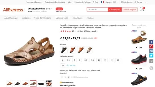
The AliExpress product page follows a classic structure. However, it’s very rich in information: the screenshot above shows the elements above the fold, meaning the content visible on your screen without scrolling.
Above the fold, you’ll find:
- The product name, which also serves as a description
- A large product image for a detailed view
- Smaller images showing all available colors
- All available sizes: between sizes and colors, you’re presented with nearly 60 product options at a glance
- Similar products in the right-hand column
- The product price, with a major discount
- Assurance of fast and free delivery
- Many reassurance elements: numerous and highly positive reviews, plus a strong rating for the selling store. AliExpress wouldn’t feature a poorly rated store in its newsletter!
Note: There’s no CTA (Call-To-Action) above the fold. To reach the “Buy” button, you’ll need to scroll a bit. AliExpress focuses first on product arguments before pushing for a purchase. However, once you start scrolling, the CTA follows you throughout the rest of the page.
Landing Page Example: Cdiscount
Cdiscount is also a major player on the French web. Their promotional emails offer deals and discounts, directing users to carefully designed landing pages. Here’s an example.
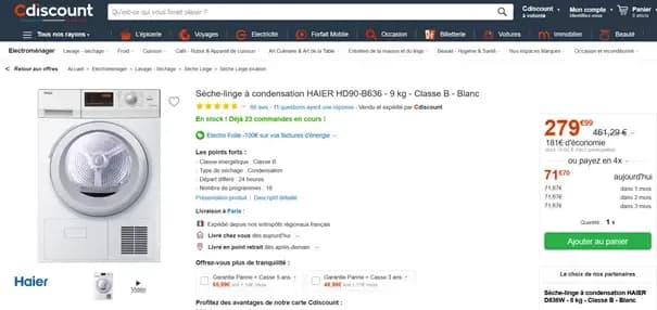
This landing page example differs slightly from the first one. It shares some common elements:
- Product title and detailed description
- Large product image
- Smaller image galleries
- Fast delivery
- Highlighted promotion
- Multiple reassurance elements: excellent ratings, trusted brand, warranty options
However, there are several key differences from the AliExpress landing page:
- The CTA is clearly visible above the fold
- Multiple payment options are offered, either cash or credit
- It includes urgency marketing tactics. Urgency marketing pressures users to buy by making them believe, for example, that the product or offer will soon be unavailable. Here, the note “23 orders already in progress!” highlights the product’s popularity, suggesting it may soon sell out.
- Cdiscount doesn’t display similar products above the fold
This landing page’s strategy is slightly different. Instead of reassuring the user and showcasing a wide range of products to ensure they find what they want, Cdiscount aims to quickly push users toward an impulsive purchase.
Create a Landing Page in 4 Steps
Now that we’ve seen several landing page examples, how do you create an effective one? As you’ve noticed, multiple strategies exist, and the elements above the fold must be carefully selected. But other factors also come into play. Discover the steps to create the perfect landing page.
Define Your Page’s Goal
The first thing to do is define your landing page’s objective. Are you trying to sell a product? Build an online community? Offer a service trial? Generate leads?
The strategy you adopt—and thus your webpage’s design—will depend on this goal. If you want to sell, you’ll need to focus on product arguments, featured items, and CTA placement. If you simply want to share a blog post, make sure the title stands out and users understand that the article continues below the fold.
Defining your landing page’s goal is therefore crucial to its creation.
Landing Page Design: A Key Element
Once this goal is set, you’ll need to think about design and the elements you’ll show users.
Your landing page’s design should generally match your website’s overall design. Use the same colors, fonts, logos, and shapes found elsewhere on your site. Users—especially regular ones—shouldn’t feel like they’re in unfamiliar territory.
However, you can still take some creative liberties with your usual page design.
A very concrete example.
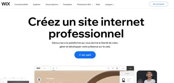
If you search Google for “create a website,” you’ll find Wix.com at the top of the organic results. But Wix may also appear in paid results for the same query. However, the site offers two very different pages for each.
Wix’s Organic Landing Page
Wix’s Paid Landing Page
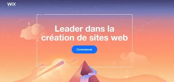
The second page aims to “activate” the user much faster. It includes just four elements: a colorful background image (creative appeal), the Wix logo (brand reassurance), an authority argument (reassurance for all users), and a simple CTA to engage the user. The top menu is removed to prevent users from navigating to secondary pages.
The first landing page is more detailed, with additional elements.
The design of these two pages actually serves two distinct goals. The first, before converting, aims to secure a top spot in Google’s search results. Page content is therefore critical. The second doesn’t need to worry about such considerations: it’s entirely dedicated to activating the user.
Your landing page’s goal thus influences both your strategy and its final design.
Copywriting: The Art of Turning Your Landing Page Into a Conversion Machine
Once you’ve decided which elements to include on your landing page, you’ll need to write its content. The art of crafting engaging text is called copywriting. Writing techniques exist to boost user interaction, increase engagement, and spark curiosity…
Monitor Your Load Times
Once your page is designed and written, one final element remains: ensuring it’s technically sound. This involves three key aspects: checking browser compatibility, responsiveness, and fast loading times.
For browser compatibility testing, a manual check is sufficient. Open your page in Firefox, Chrome, Edge, and Opera—the four main browsers. Ensure all elements load correctly and are in the right place.
To verify that your page is mobile-friendly and responsive, Google offers a free and quick tool: the Mobile-Friendly Test. Simply enter your page’s URL, and the tool will indicate whether all elements are properly adapted for mobile. However, we still recommend a manual test, either with your phone or using your browser’s developer tools.
Finally—and this is an often-overlooked but critical point—ensure your landing page loads quickly. On average, your conversion rate drops by 7% for every extra second of load time. A slow-loading landing page means lost business. Many tools can help you improve page load times. Don’t hesitate to use them! Among them: Google’s PageSpeed Insights.
You now know all the steps to create a high-performing landing page! Start with your goal: this will shape your design and copywriting. Once these elements are ready, ensure your page functions smoothly. You’ll then have a solid foundation to drive users toward higher conversions!
CRO Tips for Creating the Perfect Landing Page
To complement these steps, here are a few CRO (Conversion Rate Optimization) tips:
- Your landing page’s title is often a deciding factor. It should entice readers to learn more
- The offer you present is obviously essential. Provide promotions, a wide product selection, or offer a downloadable ebook to collect leads—in short, deliver value to your users
- Use reassurance elements like ratings, customer reviews, or trusted brands. This is also known as social proof: it’s not you trying to convince potential customers, but satisfied customers doing it for you!
- Place your CTA in a visible and easily accessible spot for users
- Reduce friction. Friction refers to the number of clicks a user must make to buy an item or the number of fields they must fill in a form. Friction is anything that can frustrate a user
- Minimize distractions. Like Wix, you can remove site navigation to keep users focused on your CTA
Keep all these elements in mind when creating your landing page: you’ll maximize your chances of converting users!
Landing Page Builders: The Best Tools to Create Landing Pages Without Coding
Now that you understand how to create a landing page in theory, it’s time to put it into practice. There are tools that let you create your page without coding and without hiring a developer. They’re highly practical for boosting efficiency in your marketing campaigns. These are called landing page builders.
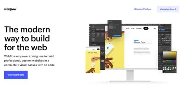
Webflow
Webflow is a website editor that lets you build entire websites without coding. It’s highly practical and offers many templates—free or paid—that you can use to create your landing pages.
All of Scroll’s landing pages were built using Webflow: it’s our favorite CMS, and we use it for many of our clients at our agence spécialisée Webflow!
Discover Webflow
Hubspot & Sendinblue
Hubspot and Sendinblue are comprehensive marketing tools that, among many other features, allow you to create landing pages. These pages can be used on your site or embedded directly in emails. The bonus: thanks to the full suite of marketing tools provided by these platforms, you can easily analyze and improve the performance of your landing pages!
Discover Hubspot and Sendinblue
Elementor
If your site is built with WordPress, you’ve likely heard of Elementor. It’s a drag-and-drop website builder that lets you publish web pages without writing a single line of code. And yes, Elementor also offers many page templates you can reuse for your specific landing pages!
Discover Elementor
Want to improve your landing page quality?
Despite all your efforts, are your landing pages still struggling to convert? Don’t panic! At Scroll, we know how to create and optimize landing pages to help you sell more or generate more leads. If you’d like to learn more or explore our services, feel free to get in touch. A project manager will respond to your request.